Tour de Flex – New Mobile Development Additions

Posted in Adobe Flex, Flash Builder Burrito, Flex 4.5 Hero, Flex/AIR, Tour de Flex with tags , , , , , on January 27, 2011 by devgirl

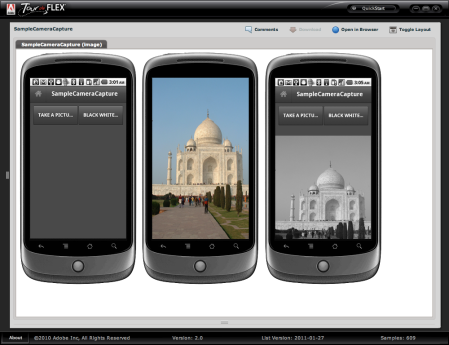
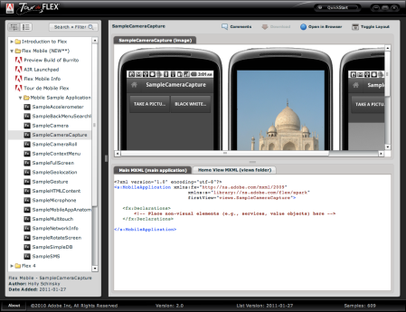
Tour de Flex (desktop and web version) were updated today to include a new mobile section showing samples using the Flex 4.5 SDK (Hero), so be sure to check it out! There are also links to download Flash Builder Burrito (Preview), Adobe AIR Launchpad, Tour de Mobile Flex and other resources to help you get up to speed with Flex and mobile development quickly.

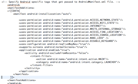
Each mobile sample includes tabs showing the main MXML file, the home view code (new in Flex 4.5 SDK) and a tab showing any required application descriptor updates, including required permissions for the android manifest. You can copy and paste the code directly into your Flash Builder Burrito project and run or debug it either in the emulator included with Flash Builder Burrito or on your own personal device immediately. Each of these samples can also be generated from the Adobe AIR Launchpad (free AIR application) directly into one project as well, so keep that option in mind if you would like to use multiple samples quickly!

Automatically Scroll Flex Mobile TextArea

Posted in Flash Builder Burrito, Flex 4, Flex 4.5 Hero, Flex/AIR, Mobile Development with tags , , , , , on December 16, 2010 by devgirl

If you’re doing any mobile development with the Flex 4.5 (Hero) SDK or Flash Builder Burrito, this tip may be useful to you. A fairly typical use of a TextArea in an application is to use it as a log where you would want it to scroll automatically as text is being added. Currently if you’re using the Mobile theme on your project, the Spark TextArea will not automatically scroll when text is appended to it as it does in a non-mobile application. It will scroll only if you are over it (if it’s non-editable) or in it and move the mouse wheel, not just as text is being appended. The reason behind this difference in behavior from a non-mobile to mobile-themed application is that the Flex Hero mobile theme uses the optimized set of components and for the TextArea, it’s actually using a MobileTextField component as the textDisplay part in the skin versus the RichEditableText component that is used in the regular Spark TextArea for the textDisplay. Now you could do something like use a non-optimized component such as the RichEditableText either directly in your application or in a custom TextArea skin as the textDisplay part, such as:

....
<!--- Defines the scroller that is used to scroll the TextArea control. -->
<s:Scroller id="scroller" left="0" top="0" right="0" bottom="0" 
				minViewportInset="1" measuredSizeIncludesScrollBars="false" hasFocusableChildren="false">
        <!--- @copy spark.components.supportClasses.SkinnableTextBase#textDisplay -->
        <s:RichEditableText id="textDisplay"
                  heightInLines="10"
                  widthInChars="15" />
</s:Scroller>
...

but the obvious problem with this is there’s a reason they built the SDK with optimized components, so we should try to work with what we have in the optimized TextArea. RichEditableText has the Text Layout Framework (TLF) support underlying, thus would not be a good choice as far as performance is concerned. Since the MobileTextField is the component used for the textDisplay skin part, we can actually use the scrollV and scrollH properties on it to scroll vertically or horizontally accordingly after text is appended to the TextArea. An example is shown here with text being added to a TextArea on a button click, and a counter is incremented to show that it’s automatically scrolling as text is appended:

<?xml version="1.0" encoding="utf-8"?>
<s:View xmlns:fx="http://ns.adobe.com/mxml/2009" 
		xmlns:s="library://ns.adobe.com/flex/spark" title="Home">
	
	<fx:Script>
		<![CDATA[
			import spark.components.supportClasses.MobileTextField;
			private var cnt:int = 0;
			
			protected function addText():void
			{
				ta.appendText('More text... ' + cnt++ + '\n');
				MobileTextField(ta.textDisplay).scrollV++;
			}
		]]>
	</fx:Script>
	<s:layout>
		<s:VerticalLayout paddingTop="30" paddingBottom="5" paddingLeft="5" paddingRight="5" gap="5"  
						  horizontalAlign="center"/>
	</s:layout>
	<s:Label text="Auto-Scrolling TextArea" fontSize="30"/>
	<s:TextArea id="ta" width="95%" height="200" editable="false"/>
	<s:Button label="Add Text" click="addText()"/>
</s:View>

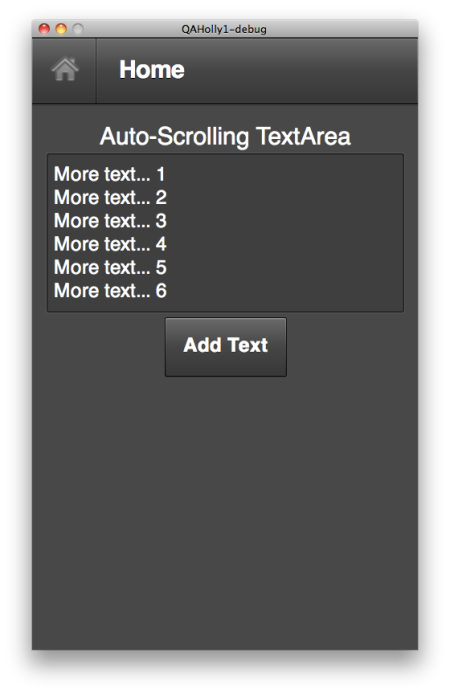
A screenshot of the above home view running in the mobile emulator in Flash Builder Burrito is shown here, but you really have to try out the code in your project to see the auto-scrolling:

Note that when you scroll vertically, the units are in lines versus pixels when you scroll horizontally. I also noticed there are verticalScrollPosition and horizontalScrollPosition properties which also appear to scroll when incremented. I was curious why there are both, and took a look at the MobileTextField.as class in the Flex 4.5 SDK. In there I noticed that when you set those properties it’s actually doing a calculation to see which is smaller, the value you’re setting versus the maxScrollV property if set, so keep this in mind if you plan to use those properties instead (similar case for the horizontalScrollPosition setter):

public function set verticalScrollPosition(value:Number):void
{
        scrollV = Math.min(Math.max(0, int(value)), maxScrollV);
}   

You should remember this MobileTextField is used behind the scenes when trying to use other properties you might need that are not available in the optimized TextArea such as htmlText as well. See this post by Brian Rinaldi for more information about using htmlText in your mobile TextArea…

Lastly, a couple things to note in regards to this MobileTextFieldd component… You cannot use it in MXML markup, it is a text primitive to be used in ActionScript skins and item renderers. Another thing to note is that the name of this class changes to StyleableTextField in future SDK releases so keep this in mind if you are using something newer than the MAX preview build.

Using Flex Containers – Tips and Reference

Posted in Adobe Flex, Flex 4, Flex/AIR with tags , , , on November 10, 2010 by devgirl

This post is intended to give developers a quick reference guide to using Flex 4 containers and layouts. Though it’s not necessarily a complex issue, it does seem to be a source of frustration for many, and particularly those beginning Flex. Code often ends up with too many nested containers and extraneous properties that aren’t serving any purpose because the developer may not understand how to use them correctly.

Below is a summary of the Flex 4 containers and some general information, including if they are skinnable, how to make them scroll etc. The minimum and default sizes are also important to make note of since it makes a difference in aligning children. Note that Basic layout is equivalent to Flex 3’s absolute layout.

• By default, Flash Builder will create an Application with a minimum width and minimum height of 955 and 600 respectively. You can change this by going into the Flash Builder Preferences and removing the minSize variable from the File Template. Go to Flash Builder | Preferences | Flash Builder | File templates | MXML Web Application. Select ‘Edit…’ and remove this from the template → ${min_size} then press ‘Ok’.

• All Spark containers above support both GraphicElements (shapes, FXG etc) and VisualElements (UI controls) as direct children. This is not the case with all MX containers.

• Some containers support nested layout tags to override the default listed above (include the layout tag as a child). The containers that allow you to nest a layout are: Application, BorderContainer, Group, Panel and SkinnableContainer

Layouts
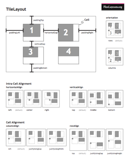
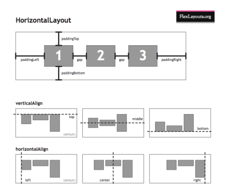
It’s often easier to grasp a concept more quickly when it’s presented visually (as they say a picture is worth a thousand words)! Below are a few images by Justin Shacklette and Gilles Guillemin who own FlexLayouts.org that really go a long way in explaining the different default layouts in Flex 4. They also show how the properties such as padding, horizontal/verticalAlign and gap would apply. You can download the reference PDF’s from here. Check out their cool custom Flex 4 layouts while you’re there!
Scrolling with Groups
Scrolling is much different in Flex 4 compared to Flex 3 since the scrolling is not built into the component. The best practice for scrolling a Group is to wrap that Group (or HGroup/VGroup etc) in a Spark Scroller object. The key with the Scroller is to set the width and height to the size of the contents you want to be viewable. You can also set a scroll position to display the contents at a current location within that range. If you don’t set width/height, or if you set it to values bigger than the contents, the scrollbars will never appear. For instance, consider the following code, and the result showing no scrollbars (since the width and height were equal to the size of the image). The same result would occur if the width/height were omitted from the Scroller object completely:

<?xml version="1.0" encoding="utf-8"?>
<s:Application xmlns:fx="http://ns.adobe.com/mxml/2009" 
			   xmlns:s="library://ns.adobe.com/flex/spark" 
			   xmlns:mx="library://ns.adobe.com/flex/mx" minWidth="955" minHeight="600">
	
	<s:Scroller width="300" height="300">
		<s:Group> 
			<mx:Image width="300" height="300"
					  source="@Embed(source='logo.png')"/> 
		</s:Group>                 
	</s:Scroller>
</s:Application>

Now in the following code, half of the image will appear vertically along with a vertical scrollbar allowing the other half of the image to scroll. No horizontal scrollbar will be added since the height will be sized to the content height by default:

<?xml version="1.0" encoding="utf-8"?>
<s:Application xmlns:fx="http://ns.adobe.com/mxml/2009" 
			   xmlns:s="library://ns.adobe.com/flex/spark" 
			   xmlns:mx="library://ns.adobe.com/flex/mx" minWidth="955" minHeight="600">
	
	<s:Scroller width="150">
		<s:Group> 
			<mx:Image width="300" height="300"
					  source="@Embed(source='logo.png')"/> 
		</s:Group>                 
	</s:Scroller>
</s:Application>


Scrolling a Skinnable Container
It’s recommended that skinnable containers (which includes the Spark Application, BorderContainer, NavigatorContent, Panel and Window) have the Scroller object added into the skin class around the contentGroup Group object. An example of how this can be done is shown in this code snippet taken from a custom SkinnableContainer MXML skin.

<s:Scroller width="100%" height="100%">
	<s:Group id="contentGroup"  minWidth="0" minHeight="0" />
</s:Scroller>

The alternative is to nest a Scroller and Group around your content within your code as the first child, however the preferred method is to keep it separated in the skin class. For more details about scrolling and containers, see this link.

Layout Guidelines
• If the container of the object has basic or absolute layout, use constraints such as left, right, top, bottom, horizontalCenter, verticalCenter to determine its placement.

• If the container of the object has a vertical or horizontal layout (either with the layout tag or using HGroup/VGroup), use the horizontalAlign, verticalAlign, gap, paddingTop, paddingBottom, paddingLeft, paddingRight attributes to control the children and the whitespace around them. These attributes cannot be used with a basic/absolute layout.

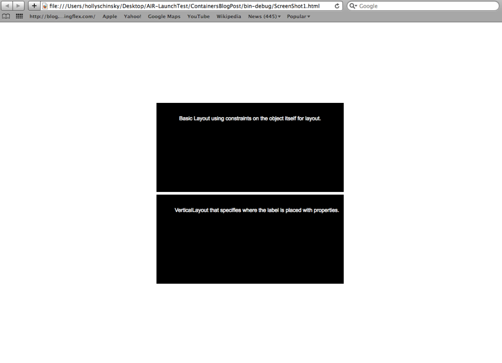
Note the following code and screenshot showing two containers each with a different layout and properties specified but displaying the same result:

<s:Application xmlns:fx="http://ns.adobe.com/mxml/2009" 
			   xmlns:s="library://ns.adobe.com/flex/spark" 
			   xmlns:mx="library://ns.adobe.com/flex/mx">
	<s:layout>
		<s:VerticalLayout horizontalAlign="center" verticalAlign="middle"/>
	</s:layout>
	
	<!-- Container 1 has a BasicLayout (default) and uses constraints on the label itself placement -->
	<s:SkinnableContainer id="c1" backgroundColor="0x000000" color="0xFFFFFF" width="420" height="200">
		<s:Label horizontalCenter="0" top="30"
				 text="Basic Layout using constraints on the object itself for layout."/>
	</s:SkinnableContainer>
	
	<!-- Container 2 has a VerticalLayout with align and padding properties set on it for label placement -->
	<s:SkinnableContainer id="c2" backgroundColor="0x000000" color="0xFFFFFF" width="420" height="200" >
		<s:layout>
			<s:VerticalLayout horizontalAlign="center" paddingTop="30"/>
		</s:layout>
		<s:Label text="VerticalLayout that specifies where the label is placed with properties."/>
	</s:SkinnableContainer>
</s:Application>
• To center children within a container with a horizontal/vertical layout (or HGroup/VGroup), use horizontalAlign=”center” and verticalAlign=”middle”.

• To center a component within a container that has a basic or absolute layout, use horizontalCenter=”0″ and verticalCenter=”0″ on the component to be centered.

Note the next two code samples regarding centering showing the same exact result:

<?xml version="1.0" encoding="utf-8"?>
<s:Application xmlns:fx="http://ns.adobe.com/mxml/2009" 
			   xmlns:s="library://ns.adobe.com/flex/spark" 
			   xmlns:mx="library://ns.adobe.com/flex/mx">	
	<s:layout>
		<s:VerticalLayout horizontalAlign="center" verticalAlign="middle"/>
	</s:layout>
	<s:BorderContainer borderColor="red" borderWeight="5" width="300" height="300"/>
</s:Application>

The result:

<?xml version="1.0" encoding="utf-8"?>
<s:Application xmlns:fx="http://ns.adobe.com/mxml/2009" 
			   xmlns:s="library://ns.adobe.com/flex/spark" 
			   xmlns:mx="library://ns.adobe.com/flex/mx">	
	<s:BorderContainer borderColor="red" borderWeight="5" width="300" height="300" horizontalCenter="0" verticalCenter="0"/>
</s:Application>

The result (notice it’s the same as the above):

General Tips
• In general, opt to use constraints over absolute positioning using x,y values since constraints dynamically resize with the browser. This is even more important now when many are developing cross-platform applications for web, desktop, mobile, tablet devices etc where screen sizes vary greatly.
• Use left/right OR horizontalCenter property but not both or they compete and it’s just bad practice.
• Use top/bottom OR verticalCenter property for the same reasons as above.

IMPORTANT NOTE: When in doubt about which properties to use, switch to Design view to see what options are available in the properties panel. It will switch depending on the component selected and container layout, and it a great way to double check what you’re doing.

Quick Summary of Properties

Check out the following links for more information on this topic:
Adobe AIR Launchpad Beta Update!

Posted in Adobe AIR, Adobe AIR Launchpad, Flex/AIR, Mobile Development with tags , , , on November 9, 2010 by devgirl

The Adobe AIR Launchpad has been updated to version 2.02, which includes the following updates/fixes:

  • Context menu sample – shows how to handle the device ‘Menu’ button press to invoke a custom popup type menu within your application
  • Handle exiting event – handle the application exiting event (if exit is NOT specifically called, the application is still running in the background and activate/deactivate handlers will be used)
  • Code Formatting cleanup – fixed spacing and tab formatting
  • App Descriptor cleanup – fixed extra lines and tab issues in the android manifest section
  • Minor UI changes, missing tooltips, default splash screen image changed
  • Code sample cleanup

More new samples and updates will be coming in the next week or two so stay tuned for another update! As usual, if you have any issues or suggestions, check or post to the Adobe AIR Launchpad forum.

Note: If you haven’t seen or used this tool yet and you are using Flash Builder Burrito Preview, check out Adobe AIR Launchpad to help get you up to speed quickly on your mobile development! It was recently updated to build mobile AIR for Android applications. More information about that important update can be found in my recent blog post here.

Adobe AIR Launchpad – Gone MOBILE!

Posted in Adobe AIR, Adobe AIR Launchpad, Adobe MAX, Flex 4, Flex/AIR with tags , , , , , , , on October 25, 2010 by devgirl

Version 2.0 of Adobe AIR Launchpad Beta is now available. It includes support for the creation of AIR Mobile projects as well as some other important updates (start a new project or switch back and forth between mobile or desktop AIR projects without restarting the app)!

This new version allows you to create mobile projects based on the AIR for Android APIs and Flex Hero (codename for next version) SDK’s. With the new main menu you can select Desktop or Mobile for your project base and it will generate a ZIP file and directory folder containing all of your chosen options and samples that can be directly imported into Flash Builder. The Desktop option still targets the Flash Builder 4 IDE but the generated projects from the Mobile menu option are targeted for the Flash Builder Burrito IDE which is also still in development (get the Preview Release and development guides here!) I’ve tested with this Preview version of Flash Builder Burrito and I was very impressed overall by the stability and features already supported. I run it concurrently with Flash Builder 4 (and occasionally Flex Builder 3) and have not had any issues, so don’t hesitate to grab it and at least play with it and see what’s to come (and dabble with some mobile while you’re at it)!

Developers should note that the development of an AIR mobile application is quite different and further justifies a need for a tool like Adobe AIR Launchpad to aid developers in quickly getting up to speed with mobile development. The projects generated from the Mobile menu option are based on the new Spark MobileApplication tag and will include a first home view (using the new Spark View class) so you can see how to push and pop views based on the samples selected from the Mobile options (one view created per sample). In a Mobile AIR application you don’t define the content for the UI in the main application class, but instead create views. The Flex SDK automatically adds a ViewNavigator container object as a child in the MobileApplication that is used to push and pop views as desired. This is all totally new but Adobe AIR Launchpad contains a working example of how this is done in your generated project. The generated project also shows the use of other new Spark classes and options created to support mobile (MobileIconItemRenderer, navigationContent, splashScreenImage, how to set content on the ActionBar and more). Note that the generated samples for the mobile project option are created in the ‘views’ folder (as opposed to ‘samples’ folder for an AIR desktop project).

Probably the coolest thing about this is you can import your new generated mobile project into Flash Builder Burrito and run it on either the emulator or your device right from the IDE and immediately play with the samples. The following screenshots are from a generated working mobile project created by the Adobe AIR Launchpad running on a Nexus One:

The new Flash Builder debug configurations now allow you to debug your application as it is running on your phone and output is written to the console just as it is when you run an application on the desktop (wicked cool)!! If you don’t have a device to debug it on yet, you can also just run it in the emulator from the run/debug configurations in Flash Builder IDE so you can get started on mobile development immediately! No more command line and slow emulation (which you may have seen if you previously tried this); response time with the emulator is dramatically improved. Below is a screenshot of the debug configuration dialog from Flash Builder Burrito:

The Flex Mobile Project option will automatically default to a new mobile theme which is new in Flex Hero. This theme includes larger and more optimized fonts and UI components right out of the box. You can modify the styles on the application as you would any other as long as you’re aware that it’s within the Flex mobile theme and some styles may not yet be available. See the Flex Hero and Flash Builder Burrito docs for more details. The screenshots of the running mobile app on the Nexus One above show an example of some of the Spark components with the mobile theme.

Also, if you are not aware of it yet, there are various permissions required now in the AIR app-descriptor.xml file for the Android manifest. Launchpad will determine the permissions needed based on options and samples selected and set them for you. I also put in informative tooltips to help explain each option to get you going quickly without having to pore over Android docs. The screenshots below show an app-descriptor manifest and application MXML code generated by Launchpad:

I’ve been working feverishly to get as much in this release to coincide with MAX as possible but will still be adding new updates (and bug fixes) in the weeks to come and as the Flex SDK features are added and changed. You can download it now from Adobe Labs and it will auto-update as I continue to put out changes. If you get an immediate auto-update notice (to version 2.01), please go ahead and do the update as I made some changes and fixed some important things over the weekend after that AIR file was posted. Note that iOS specific support will be added in the near future as well!

I’d be happy to take suggestions on new features or hear about bugs you might find here on my blog or on the official Adobe AIR Launchpad Beta Forum.

Also, be sure to check out the new Tour de Mobile Flex (with source) James Ward recently created and made available today to see another great example of mobile development!

Adobe AIR Launchpad Update

Posted in Adobe AIR, Adobe AIR Launchpad, Adobe Flex, Flash Builder, Flex 4 with tags , , , on September 7, 2010 by devgirl

An update to the Adobe AIR Launchpad Beta has been made available today and includes the following fixes/changes in version 1.0.1:

  • Fixed Windows OS path issue for generated icon paths set in the app-descriptor.xml file. Paths will now have the correct path separator.
  • Allow badge graphics other than JPG to be used and named with the correct extension type. The badge image selected in Adobe AIR Launchpad will now be prefixed with the application name followed by _badgeImage and the extension of the type of file chosen in the generated project; for example: MyApp_badgeImage.jpg or MyApp_badgeImage.png..
  • Changed the size of the image required for the install badge to 215×100 to match the default badge
    from the Flex 4 SDK install badge sample.
  • Fixed issue where Alert import statement was not generated in certain option combinations.
  • Updated the readme in the generated project with more details and a link to the Flex 4.1 SDK.

Note: If you’ve already installed Adobe AIR Launchpad, you will be notified of the available update on next run, otherwise to get the latest version, download it now from Adobe Labs.

Also, check out the Adobe AIR Launchpad Forum for more details on the latest feedback and comments related to the Adobe AIR Launchpad, or feel free to comment directly here!

Attest 3.0 for Flex 4 Certification Study Released!

Posted in ACE certification, Adobe AIR, Adobe Flex, Flex, Flex 4, Flex Certification, Flex/AIR with tags , , , , , , , on September 7, 2010 by devgirl


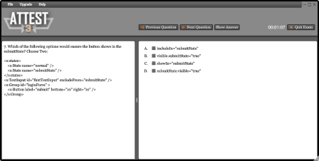
Attest 3.0 is now available for download to use for all of your Flex 4 Certification study needs and help you become an Adobe Certified Expert! Dave and I worked hard writing questions and updating the software to Flex 4/AIR 2.0 while still trying to maintain our day jobs and overcome some hurdles along the way as noted on his PXL blog. We are thrilled to have it out now and you can download it today as either a trial/free version or purchase the full version. The trial contains one free mini practice exam with 30 questions and 99 months of study (the longest trial we could choose with AIR Marketplace), and the full version contains access to all questions and features available for $20. The full version’s random feature allows you to choose a mini or full exam and will never have the same order or content of questions. It also offers an option to show the answers with each question if you want immediate validation and feedback of your answer while studying and has a ‘Study’ feature with specific links to each area to focus on for studying, which is precisely where the actual exam questions are coming from. See Dave’s post regarding the change in maintaining the different versions of Attest this time around if you’re already familiar with this software.

Many thanks to my cohort Dave for all of his hard work on this and all versions of Attest, you ROCK!! He graciously allowed me to be involved in this venture and we’ve proven to make a great team! We plan to continue to add more questions to this version and are interested in hearing your feedback on how we can make Attest better in the future!

The official details of the Adobe Flex 4 ACE exam can be found here. Happy studying and good luck 🙂


Jump Start your Adobe AIR Application Development with Adobe AIR Launchpad

Posted in Adobe AIR, Flex/AIR with tags , , , , on August 20, 2010 by devgirl

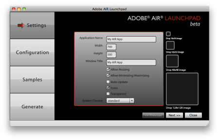
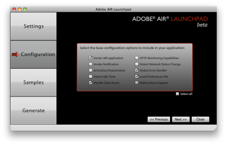
If you’ve been developing with Adobe AIR, you may find yourself often re-using pieces of code to do things such as centering your application on the screen, adding auto-update, handling network connectivity or using a local database. I just completed work on a new application from the Adobe Evangelism team called Adobe AIR Launchpad that will allow you to jump start your application development. The Adobe AIR Launchpad is an AIR application itself and allows you to choose from various options that will result in a fully generated Flex project with the settings and code selections chosen. The project can then simply be imported into Flash Builder 4 for further editing and development. The Adobe AIR Launchpad consists of 4 steps to take you through the building of your app, from the settings such as size, system chrome etc that you would usually need to update the app-descriptor XML for, to generating install badge files with a custom image if desired on the final step. The settings also allow you to specify icons for your application and the size and type will be validated to prevent error. The settings and code configuration screens are shown below:

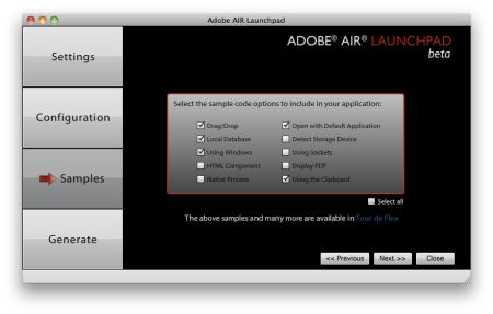
The application also allows you to choose from sample code options to be generated which can be especially helpful for newbies to get up to speed more quickly. The samples are derived from our Tour de Flex samples and generated as tabs in the resulting Flex project. They include choices such as how to start a native process, how to use the socket API, and implementing drag and drop. The screen of sample code options is shown here:

The final generate screen is shown below and has the option to include an image for the install badge:

An example of a generated application with all the sample code options selected is shown here:

The code that is generated also has comments inline and adheres to best practices. Here is a screenshot of what some of it looks like:

Note that the code generated from the app relies on features from the AIR 2 SDK, so if you’re not using it, or the Flex 4.1 SDK (which includes AIR 2 and Flash Player 101), then I highly recommend downloading the latest version here. You can install the Adobe AIR Launchpad now from Adobe Labs and can have a stubbed-out full AIR application project with auto-update, install badge files created etc in a couple of minutes or less. The release is beta and we are really looking forward to hearing feedback on the application and things that could be added or changed. I will be working on adding all the mobile options in support of the Flex Hero release as well, which I believe will ultimately make this tool even more of a must-have to get you quickly developing AIR for mobile apps!

Related posts to check out regarding Adobe AIR Launchpad:
Greg Wilson’s Ramblings
James Ward’s Blog – Adobe AIR Launchpad Intro Video
Marcel Boucher’s ‘Mind the Gap’ Adobe blog
Michael Chaize’s RIAGora blog

Also see a demo of it in this excellent video by Michael Chaize:

Flash Builder 4 Shortcuts and Tips

Posted in Flash Builder, Flex 4, Flex/AIR with tags , , , on July 26, 2010 by devgirl

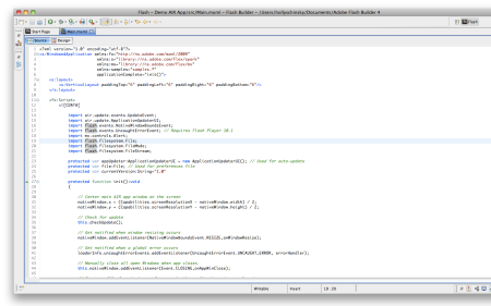
I’ve been collecting a summary of Flash Builder 4 tips I find useful to help me be more productive as a developer and thought I would share them here. I’m including the shortcut for the feature where possible (based on Mac OS, for Windows use Ctrl in place of Cmd). Please feel free to comment on other features or tips you find useful that I may not have covered!

  • Content-Assist – Ctrl-Spacebar – I’m sure most developers know of this, but if for some reason you don’t, you MUST start using this. It displays a pop up of all properties and functions available on this object. What many of you maybe do not know though, is that you can further filter this list to show only Properties, or only Events or Effects etc by pressing Ctrl-Spacebar again and again. They’re calling it ‘proposal cycling’ and it will have the name of the items you’re looking at in the bottom of the popup (All, Events, Effects, Properties etc). I am so dependent on this now I don’t think I could live without it!
  • Organize ImportsShift-Cmd-O – Cleans up unused import statements and organizes them by package. This option was available in Flex Builder but only for ActionScript files, in Flash Builder it works in MXML now too, yay!
  • Quick Outline – Cmd-O – quickly jump to a variable or function from here. Start typing the first few letters of what you’re looking for and select it to take you to it. This is one you should definitely take away from this post and use.
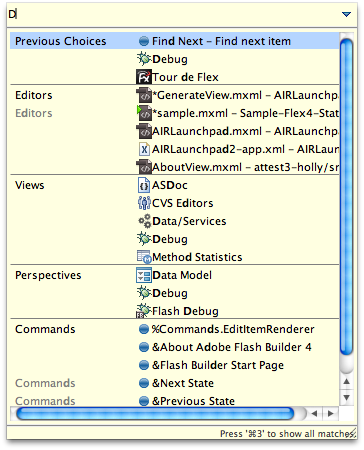
  • Quick Access – Cmd-3 – quickly execute a command or open a certain editor or view here. You can type a substring of what you’re looking for and it will show all matches, and you can even type the first letter of multiple words to bring it up, for instance if you’re looking for the Test Case Class command you could just type TCC and it will show (or tcc). Note that this camelCase typing approach works for most of the features including the code hinting. What’s really cool too is that it keeps your history, so for instance if you’re debugging an app, the Debug command will show up first in your history since it’s the last thing you used and you can quickly execute it again. I also love this feature for using the Tour de Flex Eclipse plugin view for Flash Builder, I can simply hit Cmd-3 and ‘tdf’ and it will show me that view in the popup (assuming you have installed the plugin, and if you haven’t, you should certainly do so!! Info on this plugin can be found here). Below is a screenshot this feature in use:
  • Word Completion – Ctrl-. – start typing a word and use this command (Ctrl-period) and it will guess what word you might be typing. Keep hitting it to suggest new words if it doesn’t match the first time. This works similarly to cell phone texting.
  • Fix indentation – Cmd-I – just select the block of code that needs fixing and Cmd-I will do it for you without having to manually tab.
  • Duplicates lines of code – Option(Alt)-Cmd-Up arrow
  • Move lines of code – Option(Alt)-Down or Up arrow
  • Delete line without using clipboard – Cmd-D
  • Delete last word – Cmd-Backspace
  • Quick access to definition – hold down Cmd key and highlight a function name for instance and it will turn it blue like a hyperlink and allow you to go straight to it when clicked.
  • Flash Builder built-in version control – Flash Builder actually keeps a history of your file states internally and can allow you to compare to a previous version or even revert to one using the Compare With… or Replace With… The Compare with will use an internal diff based on your current version and a version you worked on previously.
  • Set number of open editors – Flash Builder now has a setting that allows you to set a number of editors to be allowed open at any given time rather than opening an unlimited number of them. When it hits the set number it will begin closing older ones. This option is not set by default, you need to go to Window | Preferences | General | Editors and check the box and set your desired value.
  • Cycle States – Cmd-\ and Shift-Cmd-\ – when using states, this option will grey out any code not in a particular state for easier view. It will cycle to the next state or back depending on the option you choose.
  • Open Call Hierarchy – Ctrl-Option-H – shows where this function is being called from. This is useful to see how many changes would be needed for instance if you want to change or remove a function.
  • Cycle through open files/editors – Ctrl-tab – quickly hop to a different open editor. Related to this is Open Type (Shift-Cmd-T) or Open Resource (Shift-Cmd-R). These options allow you to quickly open source code files for objects in the Flex SDK or with Open Resource you can actually open any type of file.
  • Check or Modify Key Mappings – go to ‘Windows | Preferences | General | Keys’ to change your key mappings to whatever you want, or add additional ones here.

  • Generate Event Handler – if you select an event from the code hinting and hit enter you will now get an option to generate an event handler for that particular event. For instance, inline on a button, if you start typing click and select it from the intellisense popup and hit enter, you will then see an option to ‘Generate Click Handler’. If you select it, Flash Builder will add a new function to your Script block (and if there is no Script block yet will create one). Tip: set an id on your MXML component before generating event handlers and it will name the function with that id. For instance, if my button id is myBtn, the click handler generated will be myBtn_clickHandler.
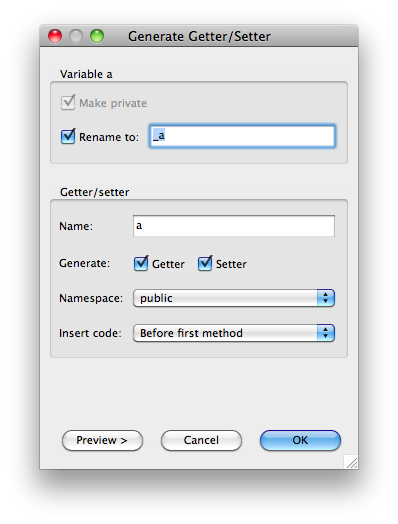
  • Generate Skin Class – this option allows you to quickly create a custom Spark skin while inline on the component. While inline on a Spark component select the skinClass property and hit enter, and you will then be prompted with an option to ‘Create Skin’. If selected you will be prompted with a new dialog like this:


    Notice that you can generate a copy of the default Spark skin and then modify as needed which speeds up the process greatly. Also note the checkbox for ‘Remove Styling Code’. If you don’t need to set any exclusions for styling then you should check this box.
  • Generate item renderer – this option works similar to the above option but for creating item renderers quickly. The option is available on all components that use an itemRenderer (including MXML).
  • Code Commenting Shortcuts – to quickly comment a block of code in ActionScript, take advantage of the Cmd-/ option. For a block of MXML code use the Shift-Cmd-C. Definitely take note of these code commenting shortcuts because I find that I’m constantly using them during debugging if I need to comment something out quickly to test, or when I don’t always like to commit to a full delete of a block of code I may be changing but rather just comment it out first.
  • Generate Getter/Setter – generates getter/setter functions for variables. This is one I often used in Eclipse for Java development and I find very useful. This option is located in the ‘Source’ menu either from the main menu or right-click context menu. Note that you need to have your cursor on the line of the variable definition in order for it to work.
  • Quick Import Statement Addition – this might be the ultimate of lazy tips, but I find myself doing it all the time. If I do not know exactly which package a particular event or something is in that does not require a variable to be created (which would add the import automatically for you), or even if I do know what package it’s in but don’t want to scroll up to add it, I will simply go up a line and quickly type a variable declaration to use the code hinting to find the Class I need and let it add the import for me, then do Cmd-D to delete that line and leave the import.

Debugging Tips

  • Conditional Breakpoints – you can now set a condition on a breakpoint that will cause it to only fire a certain number of times, or based on a certain expression or boolean (for instance it will only halt at that breakpoint when a given variable is a certain value). To set a conditional breakpoint, first set a breakpoint on a line (Shift-Cmd-B), then right click and select ‘Breakpoint Properties’. You can set multiple expressions and just separate them with a comma or even modify a line of code from here without recompiling. See the Adobe TV video link I included at the bottom of this post for some interesting things you can do with this feature.
  • Watchpoints – new to Flash Builder 4 and allows you to monitor a variable instance during a debugging session. To use a watchpoint you need to set a breakpoint and when it stops at the breakpoint, go to the variables view and right click on the variable instance to toggle a watchpoint. More information about how to debug with watchpoints can be found in this article.
  • Expressions – you can actually drag any expression into this dialog directly from your code to quickly monitor that expression. Note: if you are in the editor dialog for the Expression you can type Shift-Enter to close it quickly rather than go to a newline.
  • Run to Line – Cmd-R – while in a debug session and stopped at a breakpoint, you can choose a line further in the code to run to by going to it and doing Cmd-R or right click and find ‘Run to Line’ in the context menu to continue to run to that specific line of code.
  • Network Monitoring – new to Flash Builder 4 and allows you to inspect and monitor network traffic from your Flex/AIR apps that use HTTPService, WebService, RemoteObject, URLRequest etc. It can be used to examine XML, AMF, and JSON data sent using SOAP, AMF, HTTP, and HTTPS protocols. Note: this feature requires Flash Builder Premium and does not work with SSL or Data Management services provided by LiveCycle Data Services.

Ok, so I realize that I’ve mentioned a lot of key mappings here that may be hard to remember at first, but fortunately there’s a key mapping to show the current list of key bindings quickly that you can refer to anytime in your source using Cmd-Shift-L!

Also, to find out even more tips and tricks you can do with Flash Builder, check out this Flash Builder 4 Advanced Tips and Tricks video on AdobeTV by Scott Evans from the Flash Builder team. There’s also an article on Adobe Devnet to take a look at called Flash Builder 4 Developer Productivity Improvements by Jason San Jose. He also shares tips on his blog which can be found here.

My first AIR for Android development experience

Posted in Adobe AIR, Flex/AIR with tags , , , on June 28, 2010 by devgirl

I recently got a Nexus One phone and I’m very excited about the development potential with AIR, Flash Player and Android! Since this is a whole new world to me, I thought I would write up a post summarizing my first experience with Android mobile development. I had ventured down the iPhone/Objective-C path awhile back but the syntax was so different than my Java and other development experience and with my limited time for side projects it just wasn’t working for me. Being able to leverage my ActionScript/Flex skills for the mobile world is beyond cool! Before going into the details of my first little app however, I think it’s important to go over some terminology to clear things up for those who may not know all the mobile jargon.

iPhone: a type of phone designed by Apple (multiple manufacturers). Runs the iOS Operating System, same as the iTouch and iPad. Multiple models include iPhone 3G, 3GS and the recently announced iPhone 4, which will run the iOS version 4.
BlackBerry: one of the first smartphones to become popular among business users, and developed by Research In Motion (aka: RIM). Runs a proprietary BlackBerry OS.
Nexus One: a type of phone manufactured by HTC for Google, runs the Android OS
Droid: a type of phone made by Motorola, runs the Android OS
Android: Google’s mobile OS (Operating System) originally launched in September, 2008
Eclair : The codename for Android OS version 2.1
Froyo: The codename for Android OS version 2.2 – just recently announced
HTC : a cell phone manufacturer, like Motorola
apk : An android package file extension. This is the type of file needed to install to the Android OS.
Adobe AIR 2.5 – the version of AIR that has support for Android, with tools to package apk files from the command line. With this version you can turn an AIR app into an Android app. Adobe announced the AIR for Android Public Beta program in May, here are details of the announcement.

My first app…
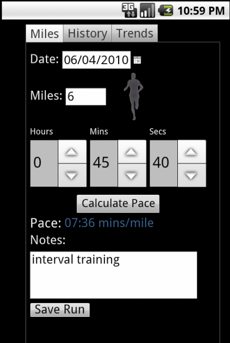
Since I’m a big runner, I decided it could be useful to develop a run tracker application for my phone. Serious runners tend to keep track of their mileage, pace, etc. so they can track their progress for training purposes. So with this in mind I went into Flash Builder and created my ‘RunTracker’ project. It’s made up of some tabs that allow you to input your running data and calculate pace, as well as show your history and pace trend in a simple line graph. The app uses SQLite (local database built into AIR) to save the run data. Here are a few screen shots taken from the Android emulator. The code for the project and the 2.1 (Eclair) and 2.2 (Froyo) versions of the apk are located here for reference. The Froyo version was built as a debug version (see notes about debug below).


A quick summary of the steps is outlined below. More can be found in the developer documentation at the AIR for Android Public Beta site. The Developing_AIR_apps_for_Android.pdf is a must read document and outlines all of the steps in depth. There’s also a great article by Christian Cantrell on Adobe Devnet that goes into designing apps for multiple platforms and screen resolutions that is worth a read here too.

1) Download the AIR 2.5 SDK and Android tools. Everything you need can be found in the documentation once you sign up for the AIR for Android public beta.

2) Create your AIR app to be used for mobile. NOTE: You need to change the WindowedApplication to an Application tag and then be sure to set visible to true in your app-descriptor.xml file, for example:

                <!-- Whether the window is initially visible. Optional. Default false. -->
		<visible>true</visible>

The following icon sizes should also be specified for low, medium, and high density screens respectively. This is the icon that will show on your phone menu.

    <icon>
          <image36x36>assets/icon36.png</image36x36>
          <image48x48>assets/icon48.png</image48x48>
          <image72x72>assets/icon72.png</image72x72>
   </icon>

3) Package your application using the adt command line tool and package an AIR application for Android. For example:
adt -package -target apk -storetype pkcs12 -keystore ../../myCert.p12 RunTracker.apk RunTracker-app.xml RunTracker.swf assets/runner72.png

UPDATE: If you want to create a debug version of your application so you can see errors and stack traces, you need to add -debug to the target such as:

adt -package -target apk-debug -storetype pkcs12 -keystore ../../myCert.p12 RunTracker.apk RunTracker-app.xml RunTracker.swf assets/runner72.png

Then install your apk to the device and while connected run the following command from the command line:
adb logcat

Then run the app in the device and you should see the trace of what’s happening in the console.

4) Install it to either the Android emulator or your smartphone device. NOTE: The emulator is VERY SLOW. I would HIGHLY recommend using a phone if you have one. I almost gave up on AIR for Android development when I had only tried the emulator because of the performance, but it’s a whole different experience when installing to your phone so don’t be dismayed! You can use the -r option to reinstall it after the first time. Make sure to exit out of the application before doing the re-install. You can specify a -d for the phone or -e for the emulator, but if you only have one of them connected or running it will use that one by default. For instance, since I have my phone connected and my emulator running, I would use this option to install to my phone only:

adb -d install -r RunTracker.apk

Also, as part of the development I noticed a few things to point out. Certain components don’t work so well out of the box without some tweaking. For instance on the Spark NumericStepper, the default arrow buttons were much too small to click on easily on the Nexus One. I decided to take advantage of the Flex 4 skinning features and create a custom skin for my NumericStepper with increment and decrement buttons that used icons and were bigger than the default ones. Since by default the keyboard would pop up on the Android device when the user clicked into the NumericStepper (so numbers can be entered versus using the arrow keys), I also added a restrict property to the TextInput part of my custom NumericStepper that would restrict the entered values to numeric only.

There are more features I plan to add to this little app, (geolocation APIs to actually track the run etc) and I’ll continue to play around with things as the AIR for Android features progress, but it was fun to get my feet wet and see what it was about. I encourage you to do the same. And if you’re a runner too, grab the apk and try it out!